I've been wanting to build some built ins in the recessed area surrounding our fireplace for awhile now. I wasn't really sure how I wanted to tackle this and at first it was just going to be shelves from the floor up. After browsing around, I stumbled onto Rebecca's media center and could see how I could turn this into my built ins!
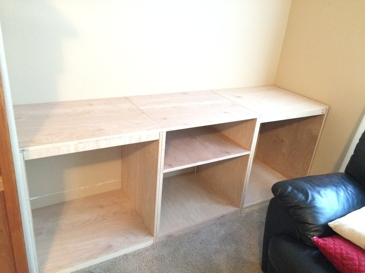
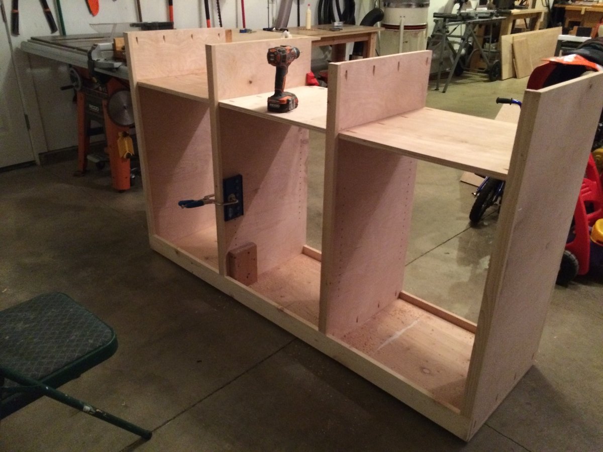
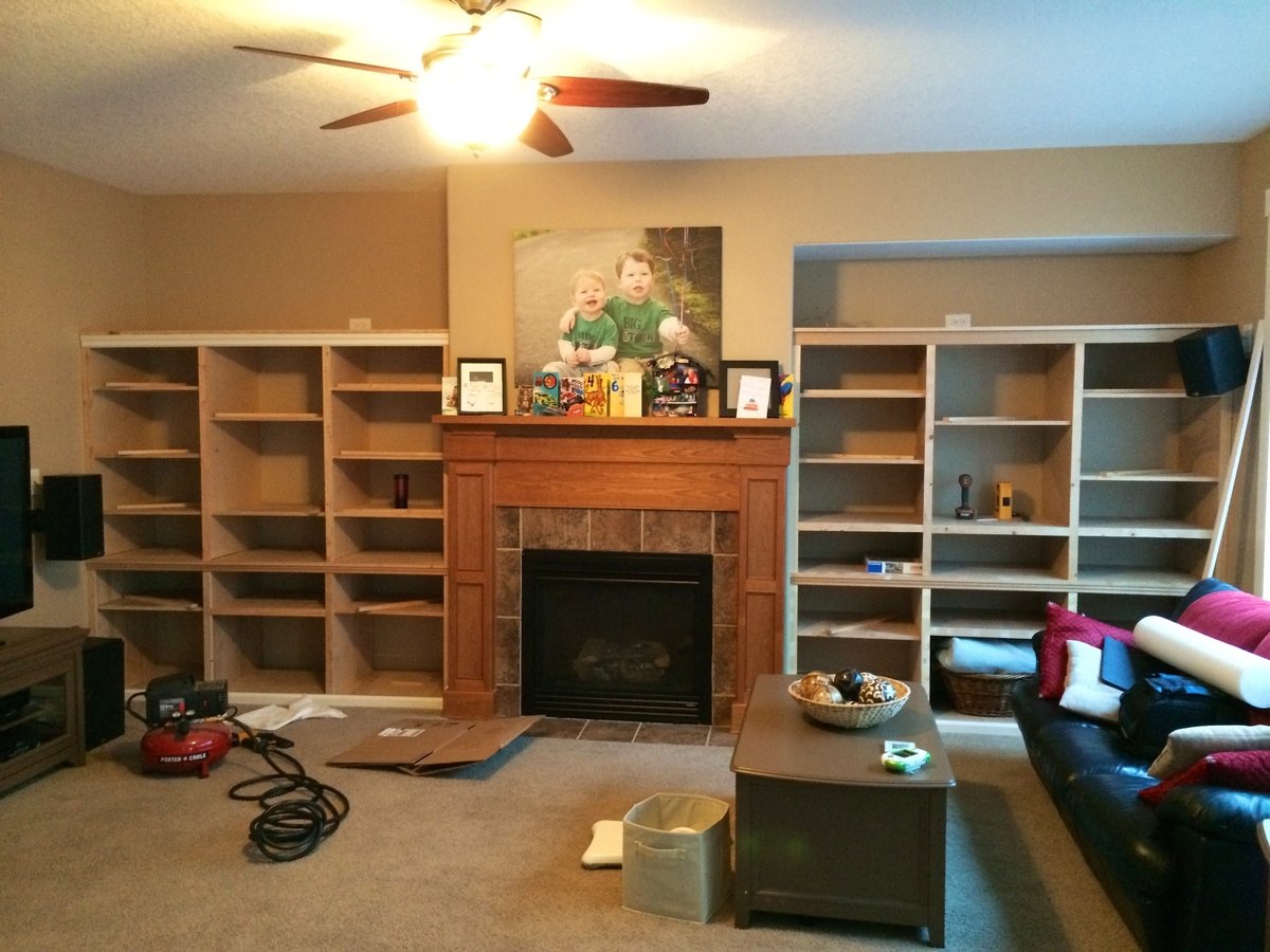
The whole thing is mostly boxes placed next to one another with trim that covers all of the seems. The bottom left and right cabinets were inspired by her media center side base and the middle of the bottom row is a modified version of the center console piece. For the top I combined the console side and hutch piece to get something that would work for me.
I learned a lot on this project and tried to take my time. Using trim across the entire project help make it look like one big piece of furniture. One thing I would do differently if I was to do this again is to use higher quality trim, such as hemlock as the pine required lots of wood filler, sanding and time, all which exceeded the cost difference between the two types of lumber. I used the Kreg drawer jig for the first time, which was nice and also used the Kreg shelving jig after I decided to make all of the shelves adjustable. It to was a nice and easy to use tool. A must for anyone who makes adjustable shelves.
I sanded, sanded and sanded some more and than put two coats of high quality primer (57$/gallon) from Rhodda, which was a God send. It hid all of the imperfections and created a nice smooth area to paint, which I used foam rollers and the Renaissance paint also from Rhodda. They said it went on and dried like a oil paint, which I love, but cleaned up with water. It was awesome paint to work with, but we'll see if it gets that hard eggshell layer that oil paint gets. It's already pretty hard the night I painted it!
The hardest part for me was going to the local Woodcraft store and deciding what hinges I need and how to adjust them perfectly! This was so hard as the tolerances were minimal and I wanted everything to be uniform. I could probably adjust them a little more!!
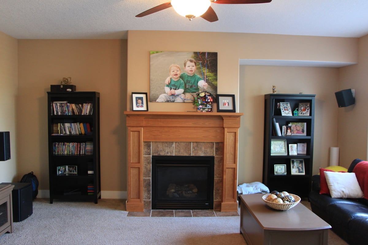
I included a picture of what the area looked like before!
The idea I had, which was the best, was when it came time to decide on a color, I had my friend who is handing in Photoshop, show me several colors on a picture I took. This changed the planned several times and save a lot of money in paint. In the end, we decided to paint them the color of the walls to make them look like they were always there. It also worked with the stained mantle next to them!


Comments
booksnotbombs
Wed, 08/06/2014 - 07:23
This is so impressive. I have
This is so impressive. I have an area in my office I want to built some similar built-ins, but I fear it won't come out nearly as nice as this. :)
Ana White Admin
Wed, 08/06/2014 - 08:54
Great Build!
That looks fantastic! Thanks for sharing!
Medickep
Wed, 08/06/2014 - 09:32
Thanks
Thanks
Medickep
Wed, 08/06/2014 - 10:15
Thanks for the kind words
The build was much easier than the finish work, which surprised me a lot! I learned a lot on this project including having good corner clamps!
Booksnotbomb-
You can totally do this, which is why I included some of the earlier photos showing it was just a bunch of boxes! PM if you need help getting started!