Rebecca Media Center Console
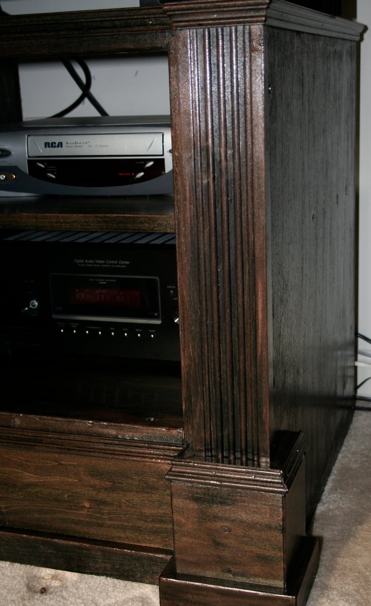
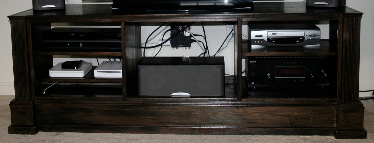
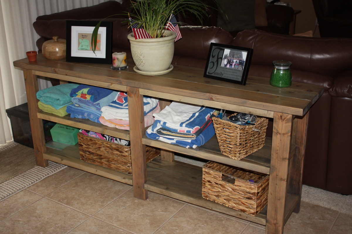
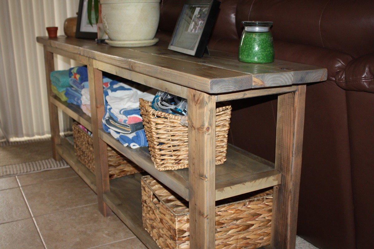
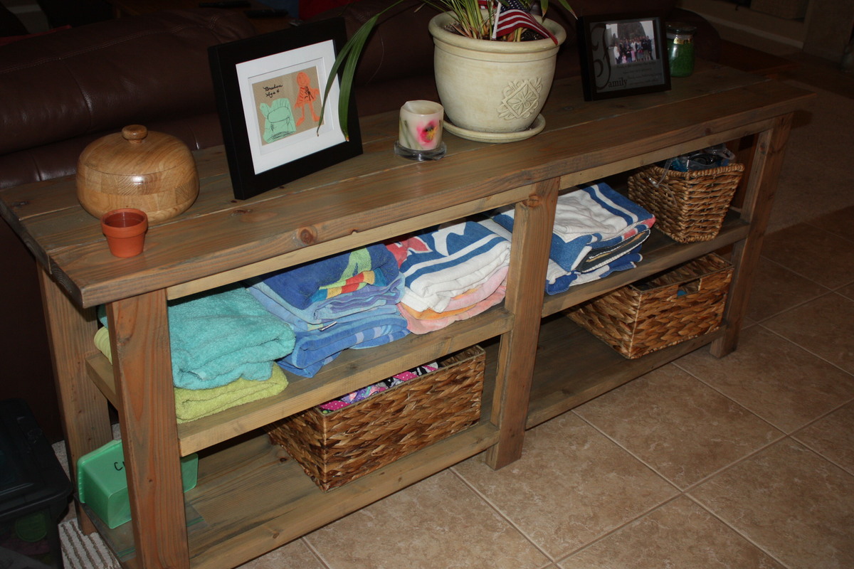
I have been needing an entertainment center for so long. When this plan popped up, my husband and I went into action. We designed this piece a little differently though. For one, the plan is too narrow for us and our tv-so our console is wider but shorter-to save on costs. Another note-we needed a place to put our computer so it can charge without our twin boys getting ahold of the cord. You can see that feature on the lower left hand corner. I also used a picture in a very well known catalog and I used the picture to get the stain just right. This might just be my favorite piece so far. I will be adding the bookcases and hutch to this. I am also in the process of adding 2 doors to this console. They needed to be stained before I could add them though.





Comments
shastacoke
Wed, 07/18/2012 - 10:22
I also wanted to note-we will
I also wanted to note-we will be adding bead board behind the middle part of this console. We are leaving the other 2 backs exposed because I don't have a router to notch out holes in bead board. :)
redhead_61
Fri, 10/19/2012 - 12:14
Awesome
Yours looks so great. Glad that our plan could inspire something for your needs. Looks great. I love the design.
shastacoke
Fri, 10/19/2012 - 12:43
Thank you
Thank you!! I saw the stain at EA and since I don't like to paint furniture I stained it black and took some copper paint from Martha Stewart and 'aged' it. I love the outcome much better than painting and waxing.