Shoe Dresser
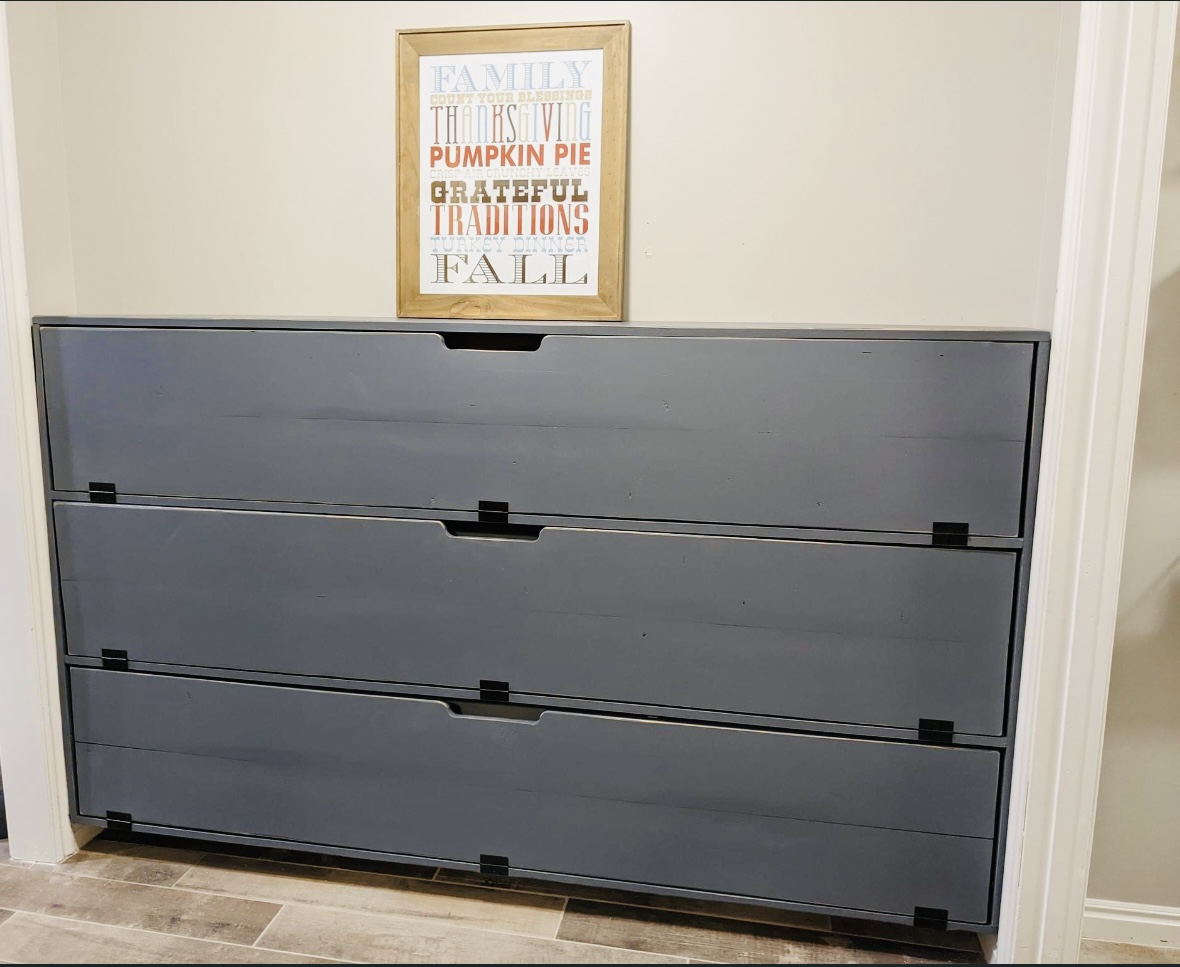
Modified the shoe dresser dimensions to fit the space.
Built by Janae

Modified the shoe dresser dimensions to fit the space.
Built by Janae
We used the Dress Up cart plan, but altered it in a few ways. We added additional storage up top and used hooks instead of a bar with hangers. We also added a mirror on one end and wheels. Visit our blog for more photos!!
http://bearrabbitbear.blogspot.com/2011/09/sneak-peak-natalees-dress-up…
Mon, 11/21/2011 - 06:29
What a great modification! i want to make this for my boys but even though they're ranging from 2 to 6 trusting them to hang things on hangars is a ridiculous request. maybe it's too time consuming for their busy little lives? who knows! but this is a great alternative! will definitely be using this plan!
thanks!
This a coffee table I built that is based on Pottery Barn's Rhys Coffee table and features and open shelf and six drawers. I modified the plans to include a top and changes to the drawer fronts. The original plans can be found here at Ana White's website: http://ana-white.com/2012/02/plans/rhyan-coffee-table

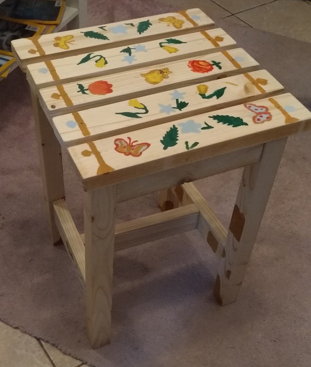
My very first woodworking project. Had to convert all plans to metric units and adapt to available wood stocks in Bucharest. If you want details, don't hesitate to contact me.
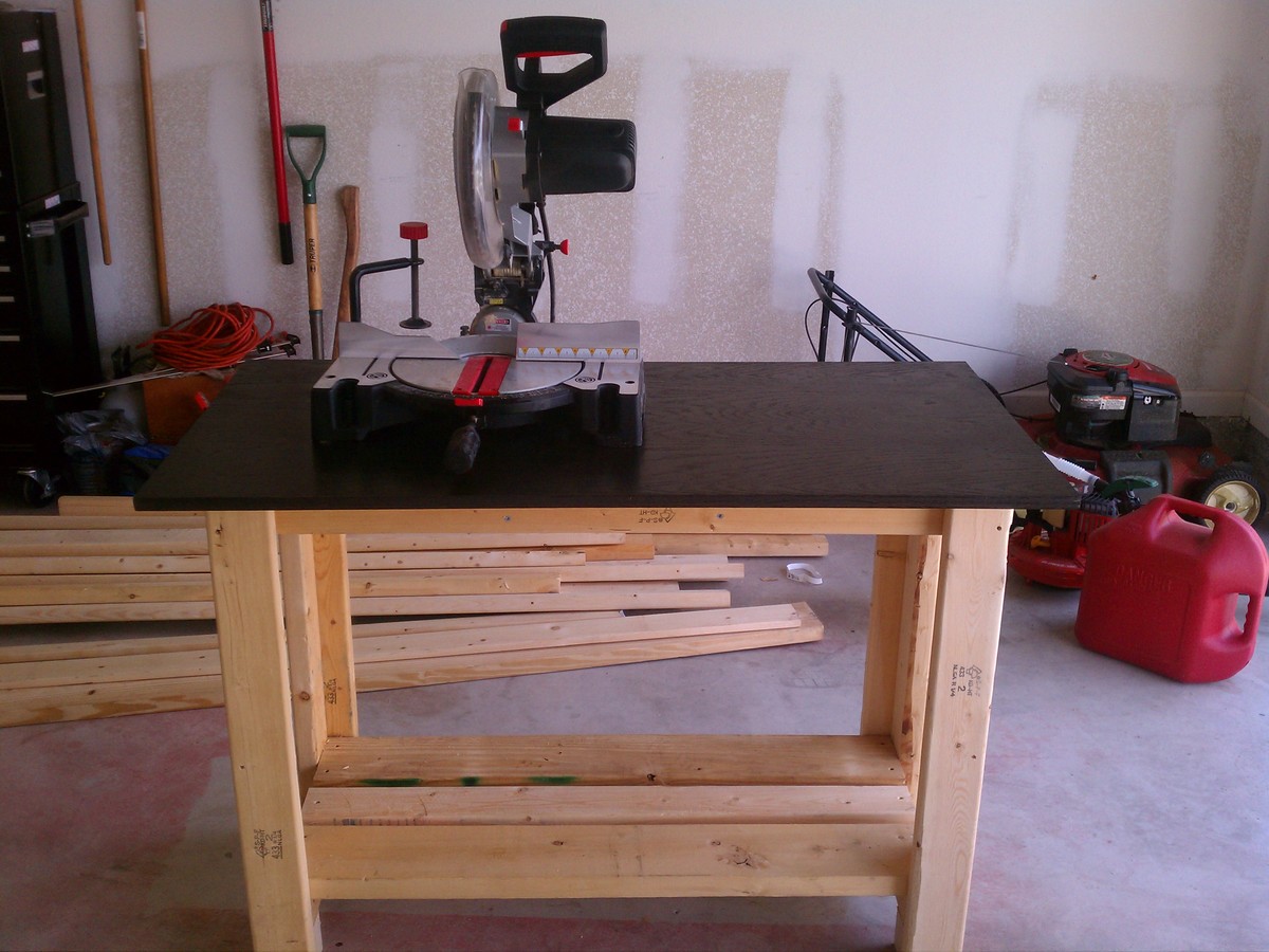
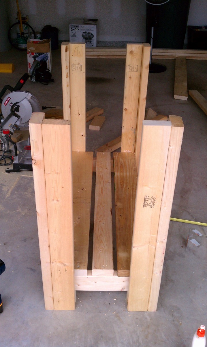
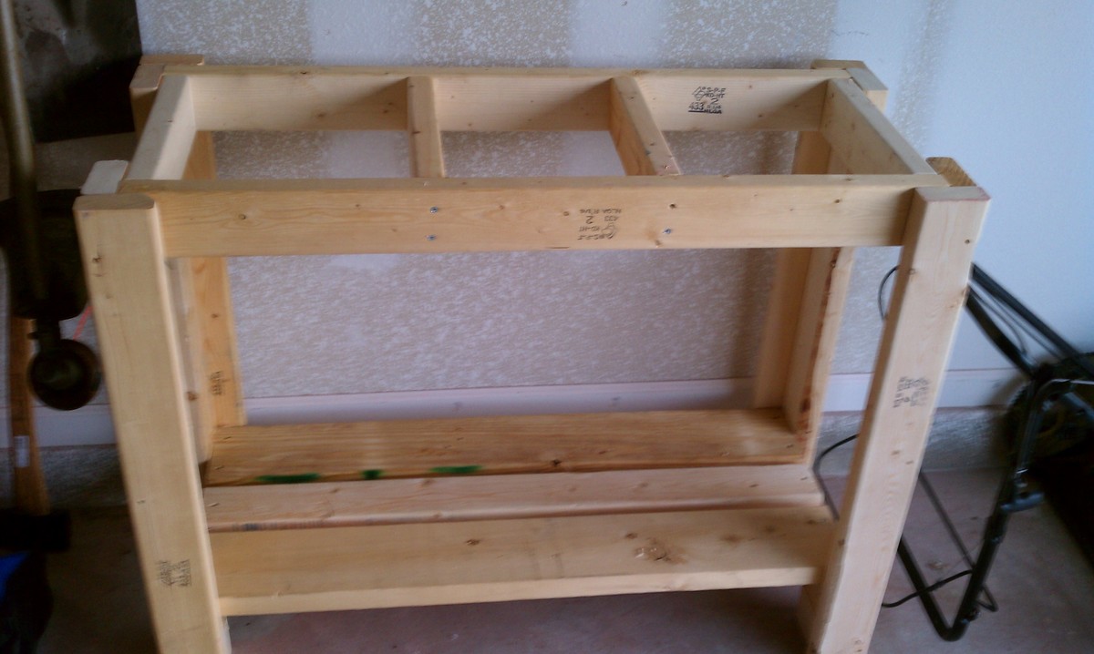
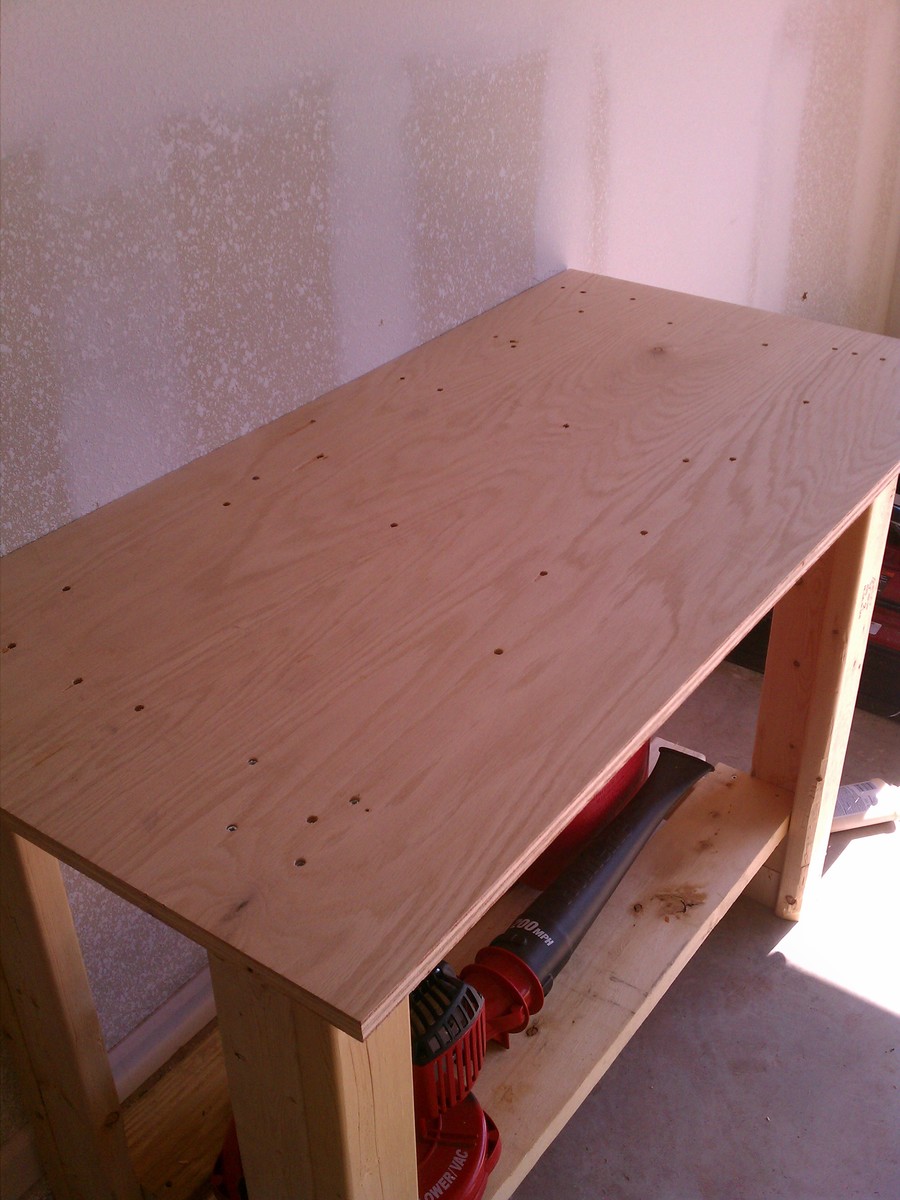
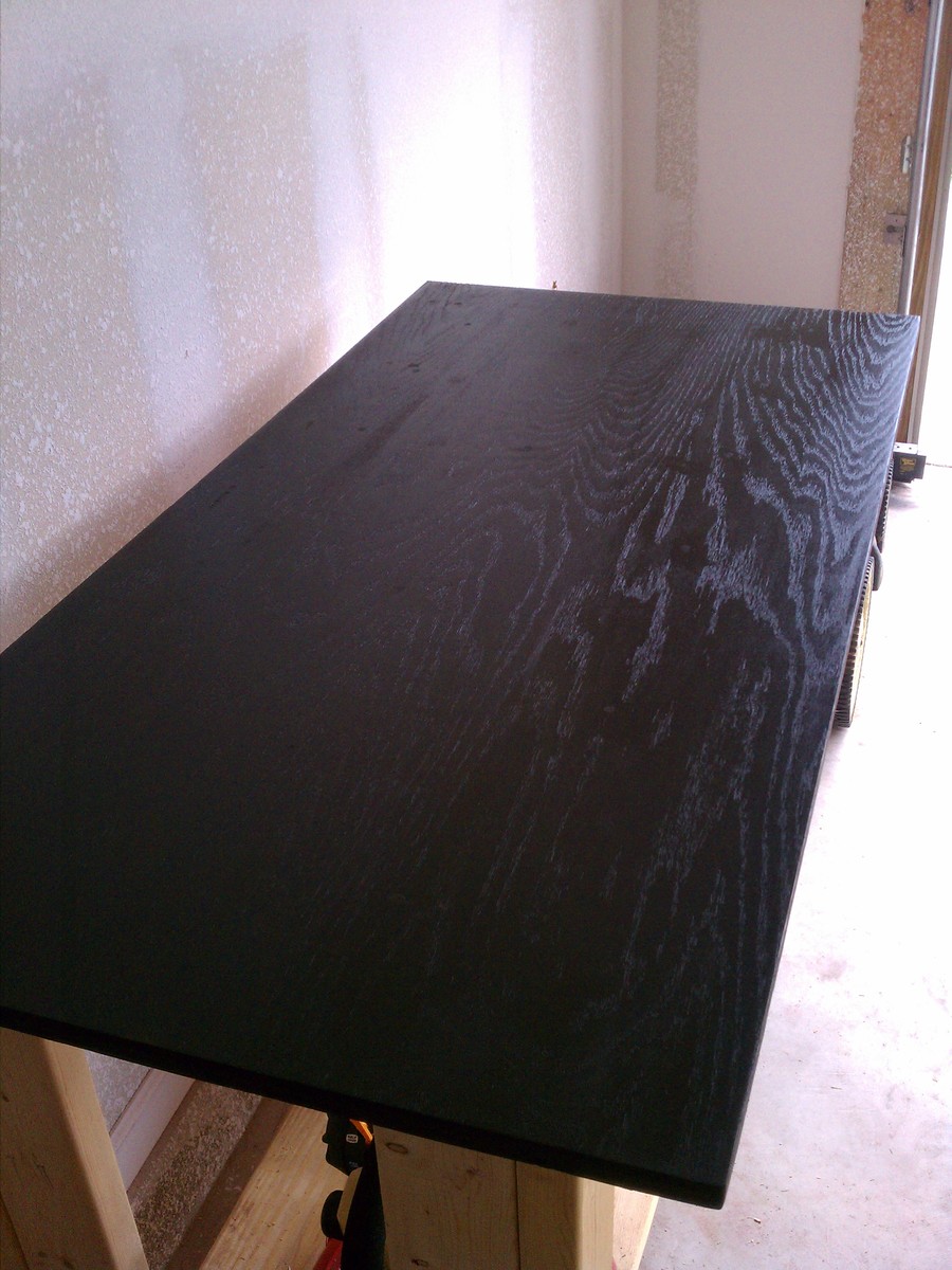
Built two of these workbenches using 2x4's I found in the dumpsters around my neighborhood. Tested out rustoleum stain for the tops. Covered really well in just one coat.
Fri, 09/09/2011 - 20:45
Looks great, I like the look of the dark top, but it might make it harder to see small objects.
Tue, 02/21/2012 - 18:52
I love how you took it one step further and stained the top. So beautiful!
Mon, 05/06/2013 - 06:49
Wow. Thank you for those unbelievably kind words. I am not an architect though. My main profession was a service manager and now I'm unemployed and partially disabled. I just love to be creative and use my hands. I also love photography. I did all my work on nights and weekends. Again, thank you for the kind words.
This was a project that I messed up and it actually turned out much better than the original idea. I wanted to to make a buffet/side-table for our dinning room but ended up measuring wrong and this turned into what it is now.
I am happy with the way it turned out. It was pretty simple to make as far as the design is concerned.
The woodwork involved was planing, cutting, sanding, etc and then there was bit of metal work like cutting and welding.
I love how the milk baskets tie things together.


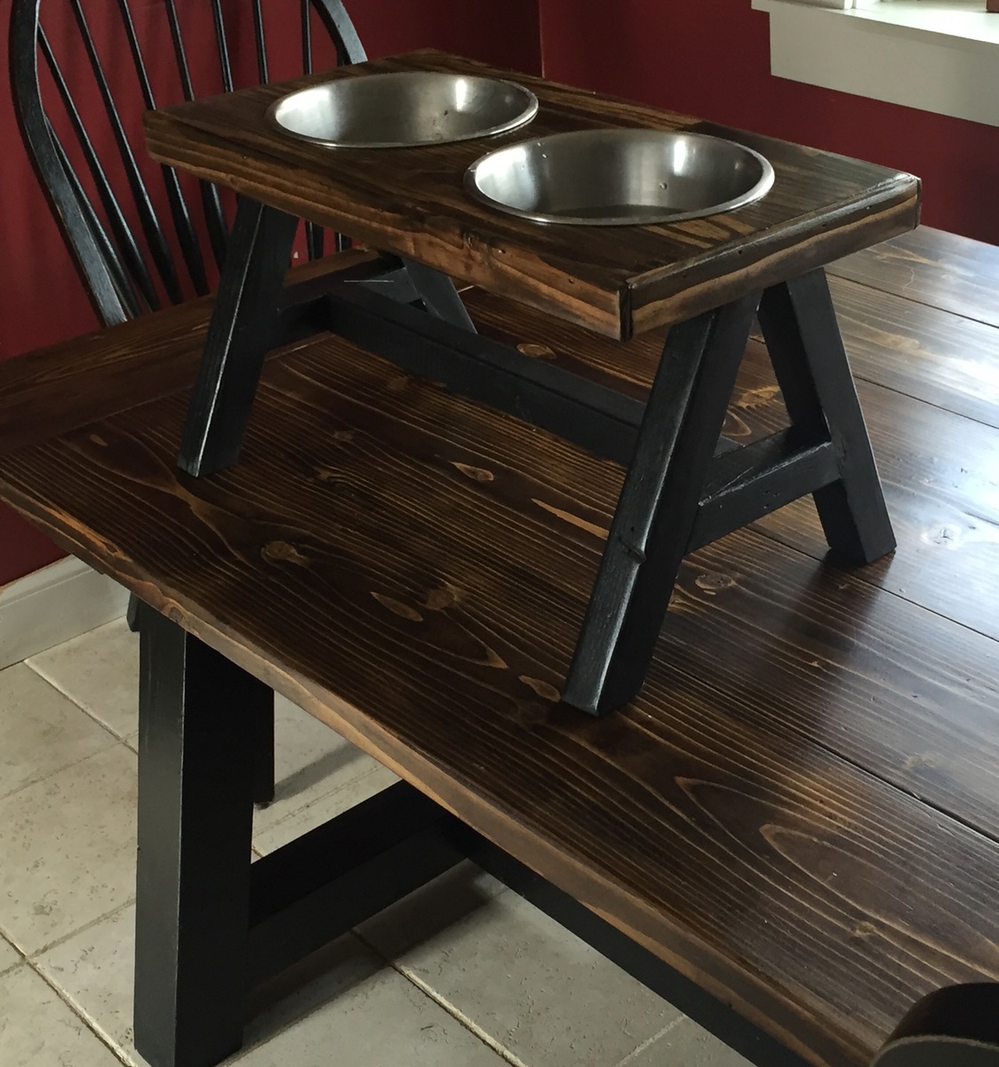
Table I built for my wife. She found it while browsing Ana's site. Loved it so much she wanted one for herself. Came out so nice we decided to make our puppy a version of her own.
LOVE THIS SITE!!!!
Mon, 12/21/2015 - 09:16
This is awesome! Love the puppy "table" too! A few people have asked for plans for the puppy table so I put this together - please, advise any changes. Thanks! Ana
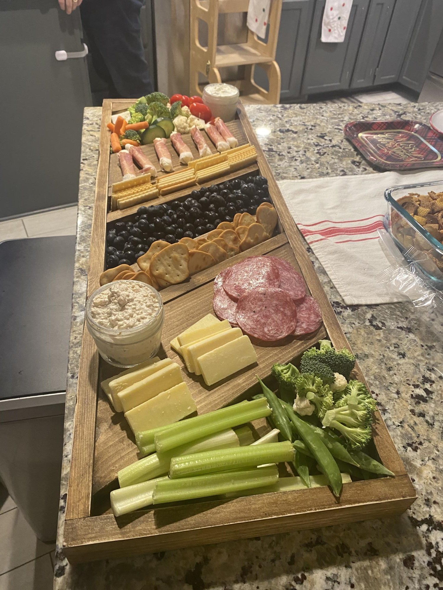
Made a this for my step-daughter and her husband for Christmas. Love your projects, and am learning to do everything on my own which is so empowering thank you for sharing and encouraging all us girls we can do it!
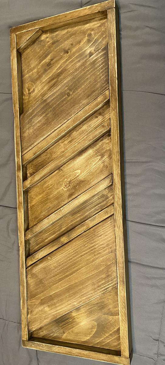
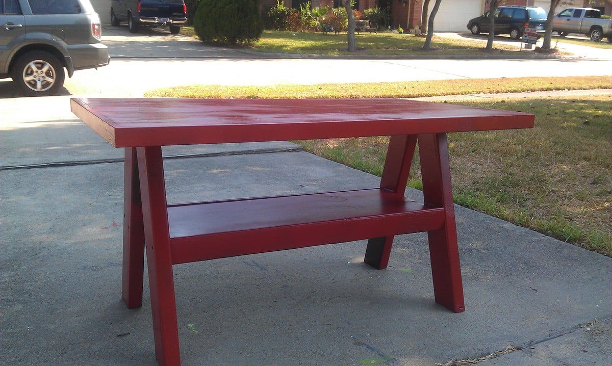
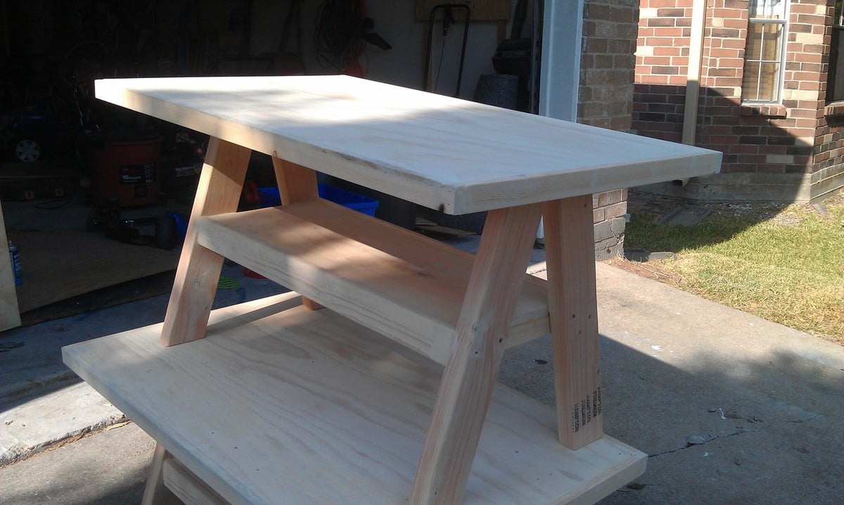
I was just about to sketchup this plan and Ana beat me to it! YEAH! I made two yesterday afternoon.
Wed, 09/14/2011 - 11:31
Oh yeah! I love this - turned out so well! Please share painted photos too - just too cute for words!
Wed, 09/14/2011 - 11:51
So glad you built this. I totally have it on my to-do list. Looks great!

We made this piece 7' tall rather than 6' tall so that it would go well in our dining room, leaving the cabinet doors the same height but adjusting the upper shelves to fit.
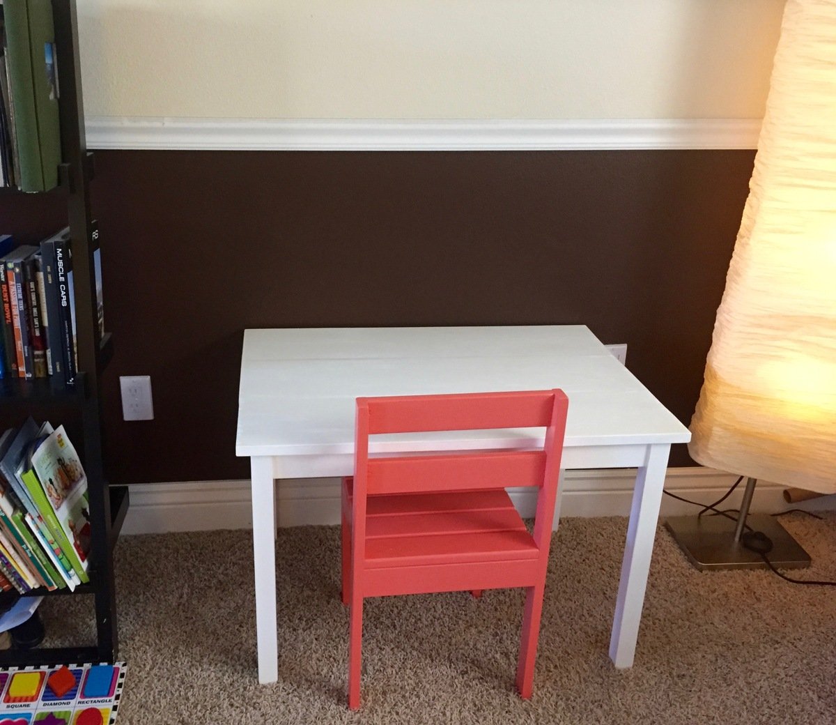
My husband I and I made this for our daughter for Christmas! It's so cute we couldn't wait and she's been sitting and playing at it ever since. We are pretty novice and building and this was easy and fun for us to complete. We will make another chair in the future, but for now we just did the one!
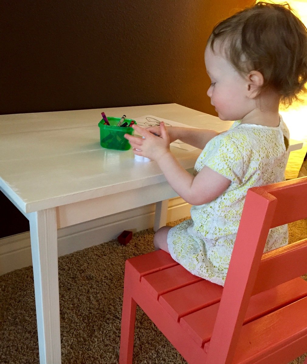
This was my first furniture build. Wanted something a little more detailed, so did solid panels, and inset molding into the panels for depth. I also wanted a taller footboard, so the panel is 18" high instead of the 15" that the plan showed. Ended up adding some crown molding as well, but mostly to cover up my mistakes. Also dressed up the side rails by covering them in a matching molding as well. Didn't want to use box springs, so moved the slats up to the top of the rail, and spaced them with 2" gaps between slats to give maximum support to the mattress. Since we have a small dog that I tend to trip over in the dark, I ran a 24' rope light along the interior side panels and footboard, and plugged into a wireless switch that I mounted to side of headboard, which I can turn on and off from bed. Stained it with General Finishes Mahogany Brown and then two coats of poly. Really happy with the way this turned out! Can't wait to do some more building, thanks to Ana! :-)
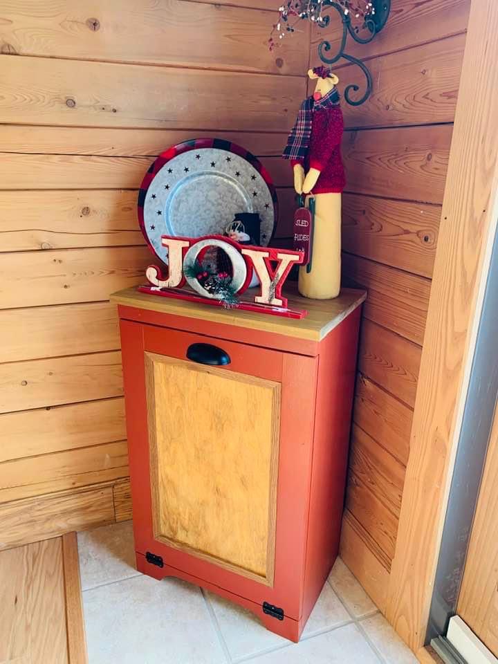
Thanks for the plan Ana… my Christmas break project. Plans were very well done….
Joe in Boston…
I spent lots of time looking at all the photos posted on this site of people's amazing renditions of "Grace's Play Kitchen." I was so inspired by everyone's creativity! I found an old wooden play stove at a flea market and decided to make a matching sink. I took Ana's plans to the carpenter at the wood shop on the military base where I am stationed and asked if he could help me build a matching piece. We spent about 4 hours one Saturday building the sink. The carpenter had so much fun helping me, he suggested I build a matching refrigerator. So that was created in another couple hours the following Saturday. I did as much of the building as I could, but definitely had some help from the carpenter as I'm a novice. (Thanks, John!) I made the curtain and matching towels, but found the apron and chef's hat on Etsy. (Thanks, "SweetApronzNCupcakes"!). The play kitchen is in my kitchen, so my two year old daughter can pretend play while I'm working on meal preparation. Thanks again, Ana and all the creative folks who contributed ideas! I foresee many hours of play enjoyed by this play kitchen, and hope it can be passed on to future generations!
Sat, 09/24/2011 - 15:49
I really like the fridge and the knobs on the stove. They look great!
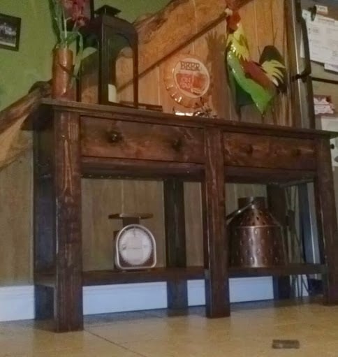
Made this for my lovely friends Melissa and Lance and their adorable little boy Rylin.
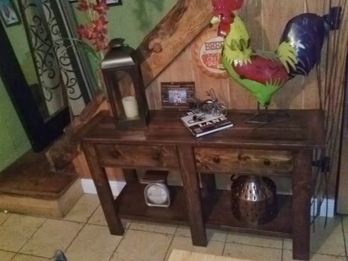
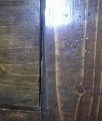
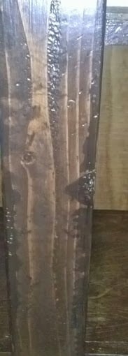
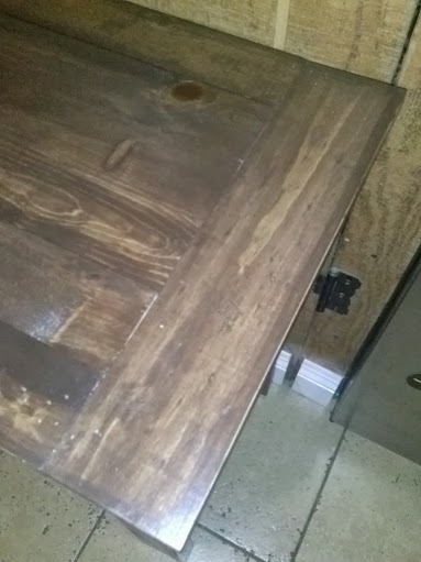
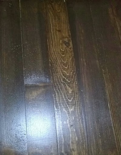
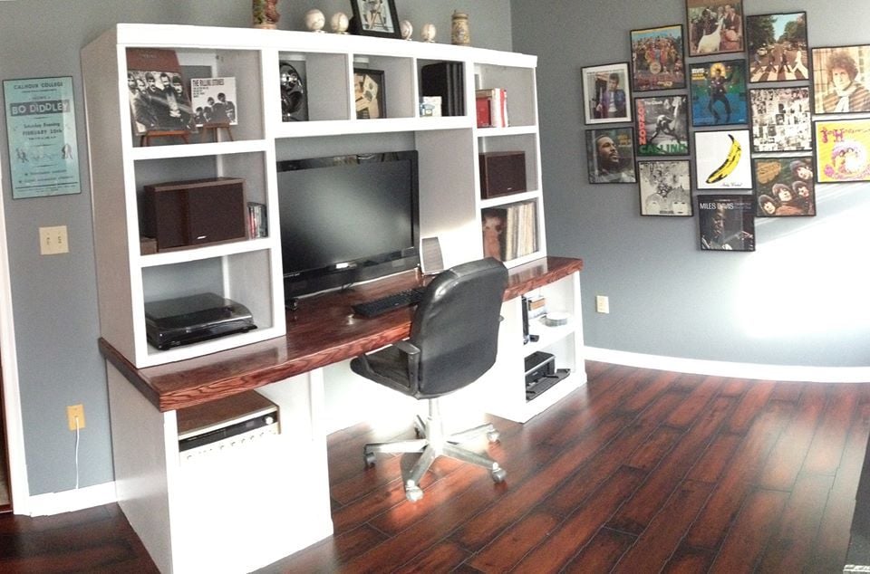
The Classic Collections was exactly what we were looking for when we decided to re-do our home office.
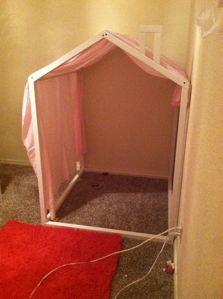
A fun project that my girls loved. Through a flat sheet on top for fun!
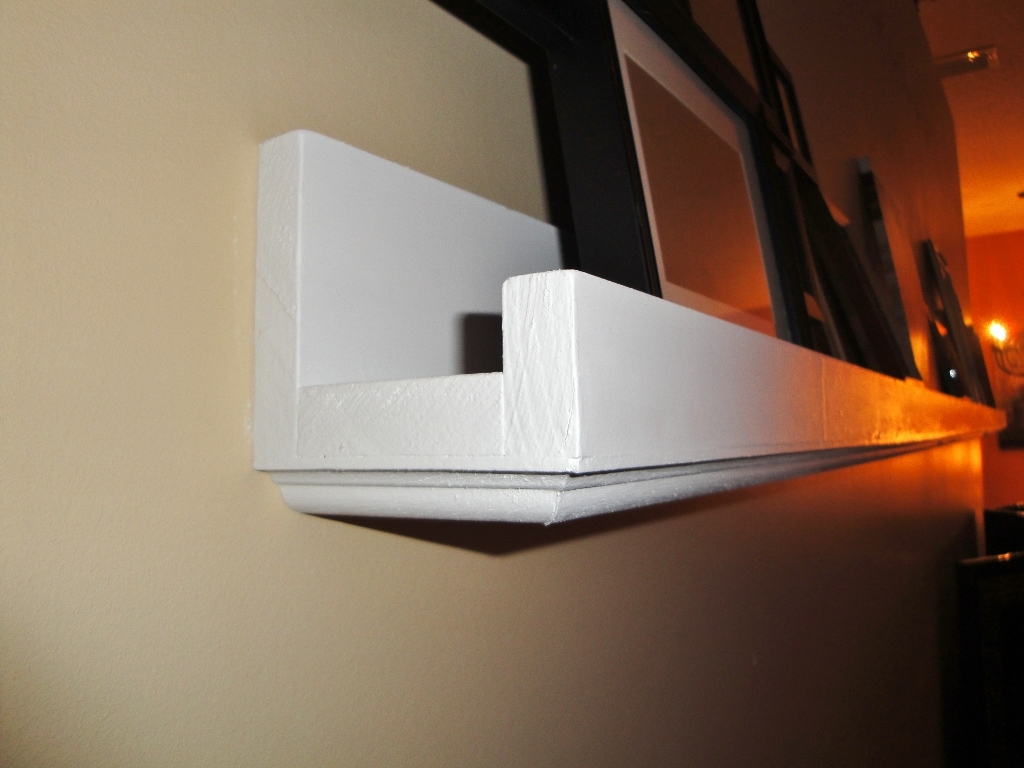
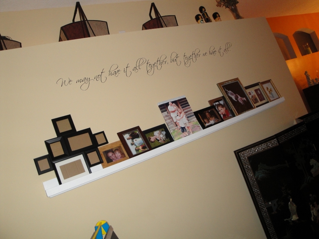
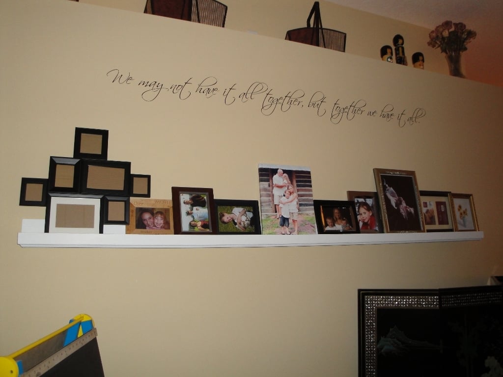
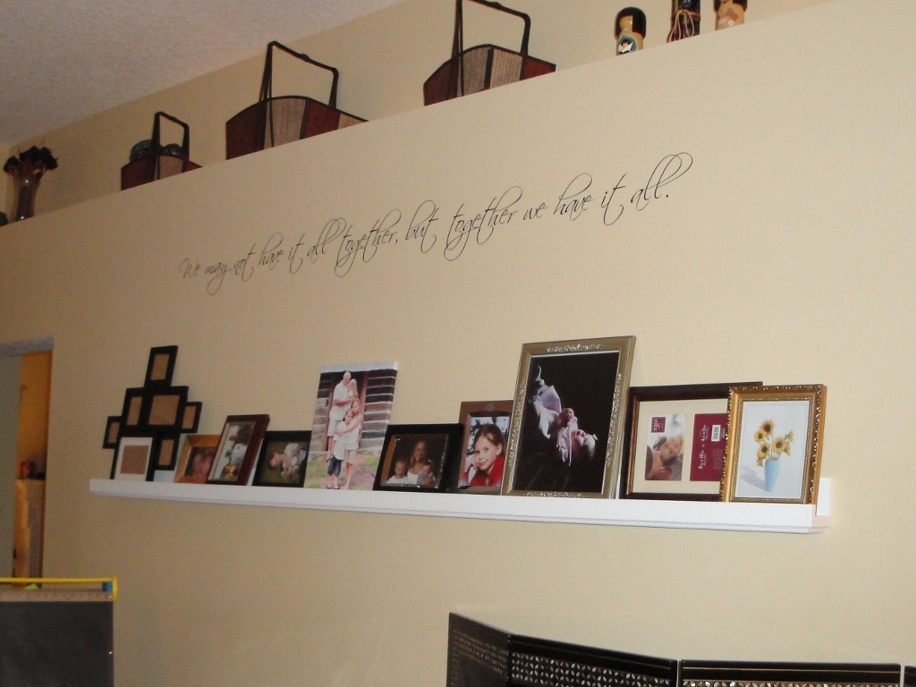
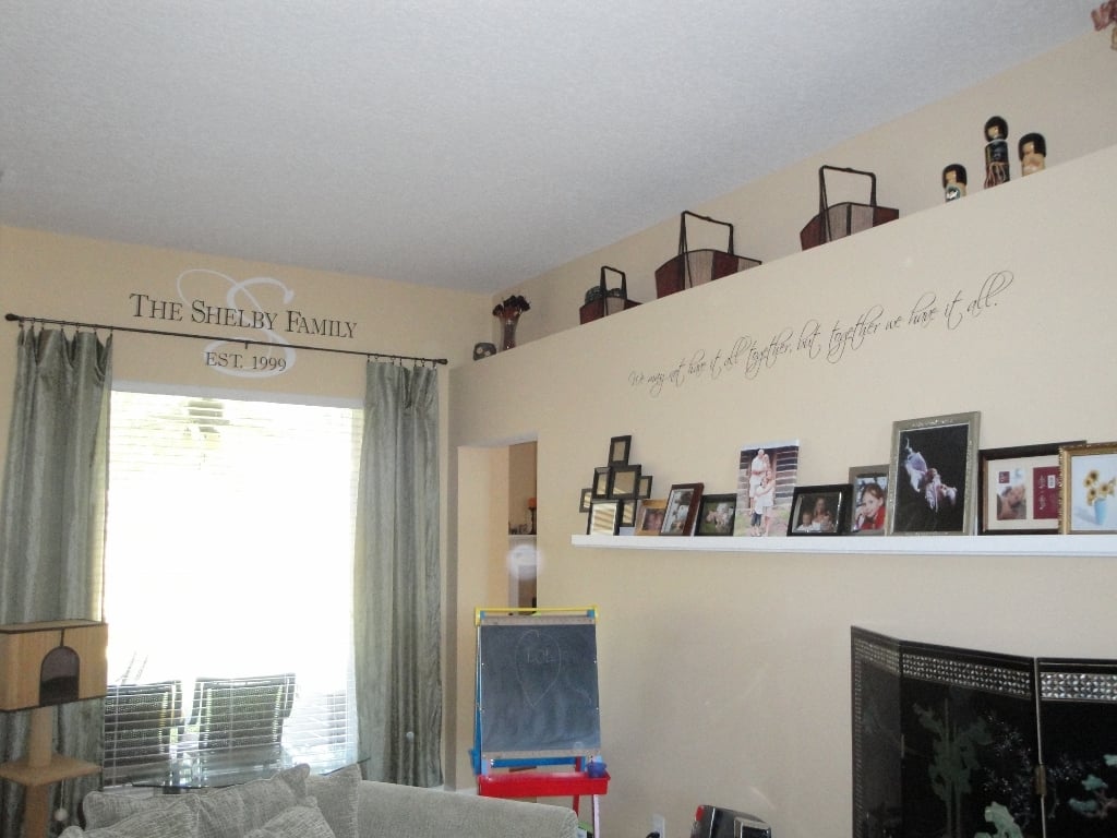
8 foot long photo ledge inspired by $10 ledges project plan, http://ana-white.com/2010/10/ten-dollar-ledges.html
I used a 1x4, 1x3, and a 1x2 and added some crown molding to the bottom for a little something extra.
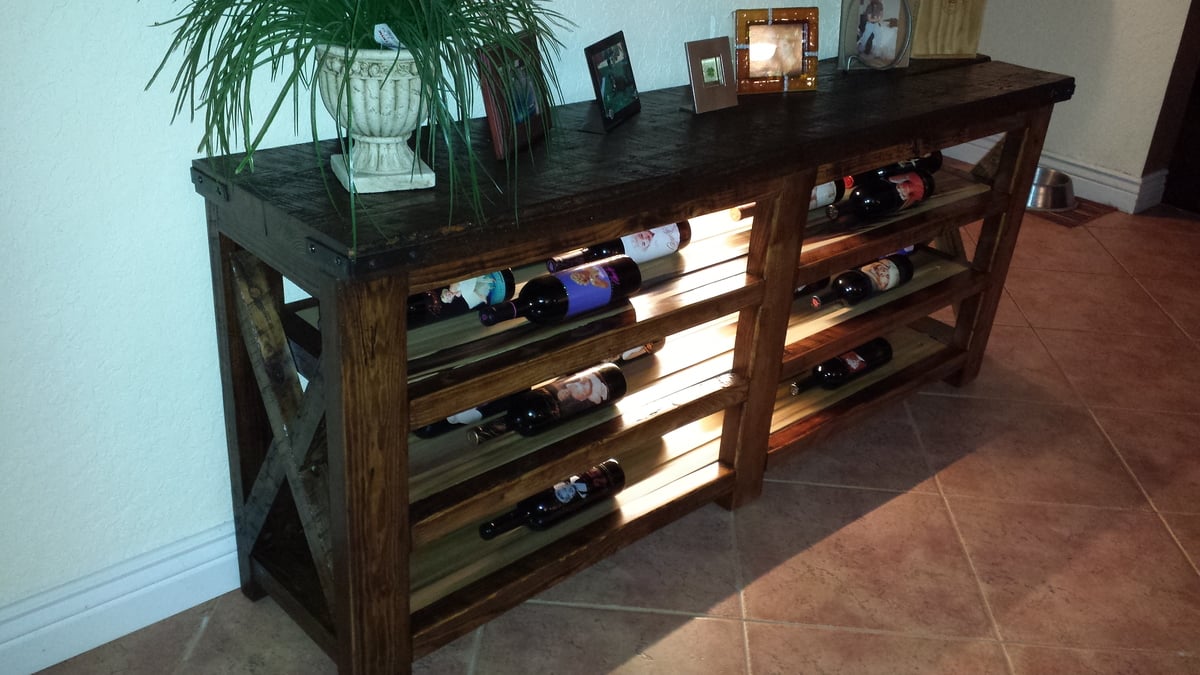
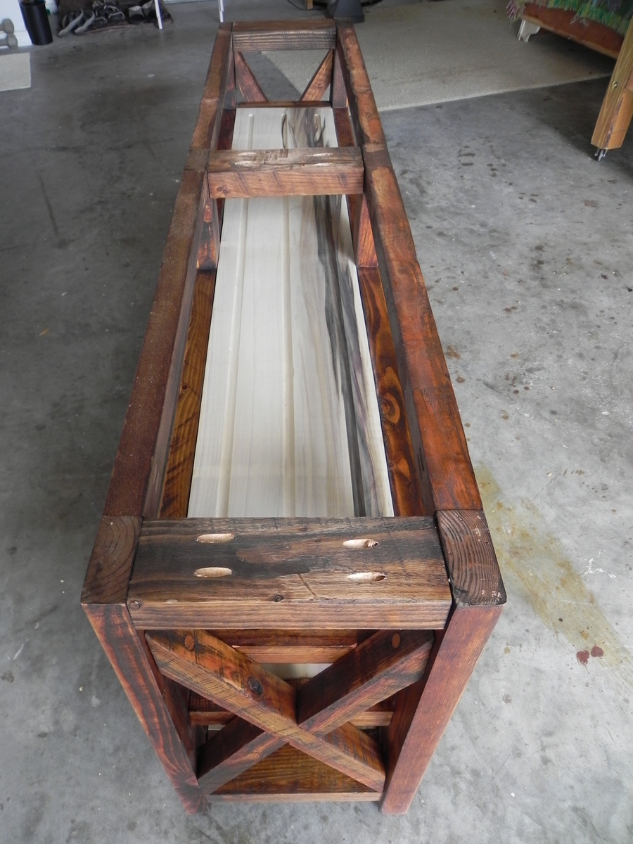
My friend saw the Gaby Kitchen Island that I posted on FB and asked me to make a wine display for him. I immediately went to Anna's site to look for a design. Added LED lights from IKEA.
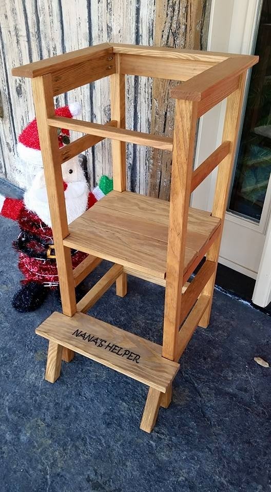
I modified the "standing high chair" from Ana's plan and from Blame Crayons blog post...so, I did a little freestyling. The standing platform is adjustable height, just like Ana's. My friend asked me to make this for her mom for Christmas.
Thu, 08/25/2016 - 08:36
I lovel your modification to add the entry-step to Ana's plans. I think I will try to re-create that myself, any special tips on adding that extra step?